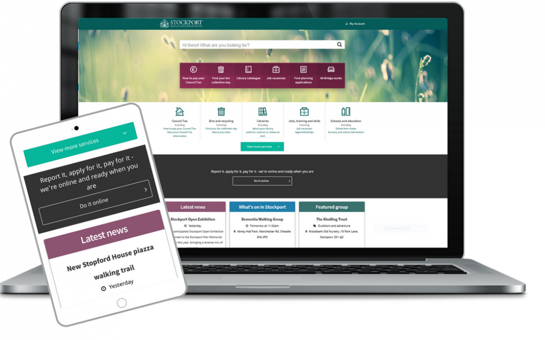
We continue to test the User Experience (UX) of our new digital products every two weeks with residents. Sometimes we are checking the UX for new areas under development but we are also always open to feedback on our home page and key navigation elements and we continuously strive for the easiest shortest customer journey to take users directly to the information, advice and guidance that they need.
This has resulted in some recent updates:
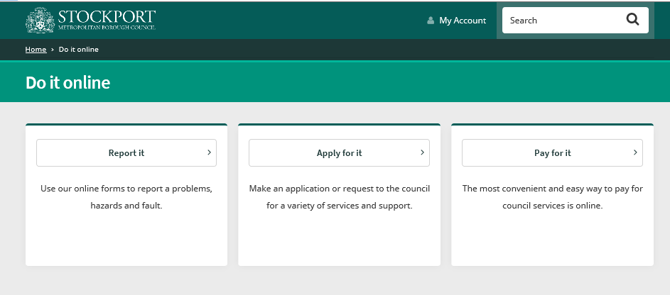
Do It Online area
We have merged the options for Report it, Apply for it, Pay for it’ to one prominent ‘Do It Online’ area which has been promoted to a full width banner across the home page. Clicking the banner takes the user to the three options, with an explanation of the types of request contained in each area. Without this explanation, users were sometimes unsure about which type of transaction they required.

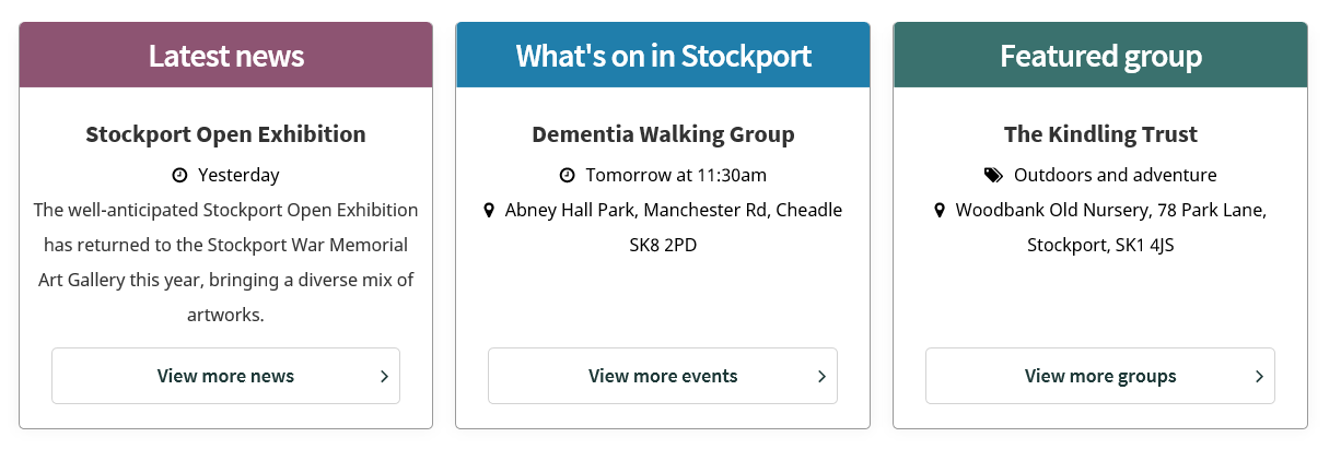
News, Events and Groups
We have introduced new card features for News items, the Events calendar and our Groups Directory. We can now include more details on the featured item. The Featured News item is automatically fed from the latest New Release but the featured Event and Group are at the discretion of the Content authors and depend on factors such as size of audience and priorities of the Council.

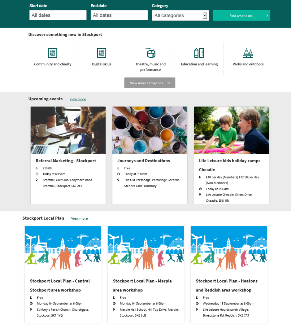
New Events home page
We have redesigned our Events home page and this will be going live very soon. The filters have been moved to the top of the page and we have introduced a new ‘card’ layout. The top 3 events displayed on the home page are the next 3 chronologically.
We have introduced tags to events which allows us to select events relating to specific themes, for example seasonal events or Consultation events and the bottom 3 events on the home page have the tag chosen as the topic of the moment.
And we have added a secondary drop-down filter for Price allowing the user to select by Paid or Free events.

New groups page
We have added more functionality to our Groups pages and this will be the subject of a separate blog – look out for lots more exciting news coming soon about this area of our website!
Alerts
Finally, a reminder of our system of Alerts banners which appear at the top of the home page from time to time. We use:
- Green alerts for information
- Amber alerts for warnings / things about to happen
- Red alerts for things that have happened
We love to hear your thoughts about using the website. If you would like to give feedback please use our feedback form or leave your comments below.

