It’s only through an exceedingly well built web presence that we can provide services which meet user needs better than ever before.
This quote taken from a 2018 blog we wrote about the then-new Stockport.gov website still very much holds true today.
When the new website was created in 2016, a sustainable, modern, and effective website was built to future-proof the council from changes in technology, requirements and growing user needs.
Rapid growth in page views
Little did we know then that the website, which took around 12 million views a year, would have to cope with the rapid growth we saw during COVID-19. We went from 12 to 20 million views per year during those years, and the website responded to that growth without a hitch. The CMS (Content Management System) and infrastructure of the website allowed us to respond rapidly to changing information and guidance from local and national government as well as meet a growing demand for services to have an online presence.
Coming out of COVID-19, we realised that the website had done everything we had originally asked of it. But the world looked a little different, and we hadn’t had the time to spend on the look and feel of the site and pay it some well-deserved attention.
New corporate brand and accessibility legislation changes
We put a small, dedicated team together to focus on what a refresh of Stockport.gov might look like. We decided this should be an evolution of the current site, not a revolution. Many of the features and components of the current site work really well, but with a new corporate brand being designed and some new and emerging requirements, it was time to imagine what the future might look like.
Stockport.gov has grown over the years and has multiple types of pages we needed to consider. We started to understand the task we were taking on, and what became clear was that it was not a small piece of work. You can’t leave a website half done; we needed a plan, so we put together a flexible roadmap. We planned a rolling programme of improvements to the site to bring it in line with our Ambitious Stockport brand and improve performance, accessibility, and navigation.
WCAG (Web Content Accessibility Guidelines) 2.2 was due to be released later in the year, and we wanted to make sure we understood any necessary changes so we could remain compliant with the Accessibility Legislation. You can read about our accessibility journey and our response to the Cabinet Office audit we received in 2021.
Reuseable, consistent and familiar
We had a few ideas about where to start but felt the homepage would lead the rest of the design, so that’s where we set our sights. Our philosophy was to build reusable components for the site, to create something that is sustainable, consistent, and familiar for the team to build and for our residents and businesses to use.
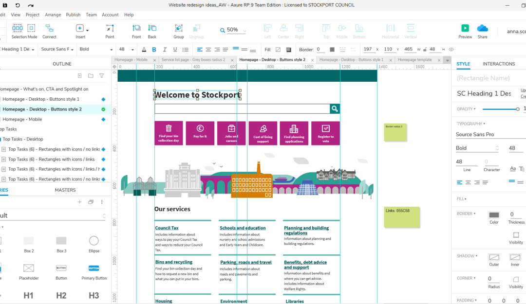
Anna, our Lead UX designer, took the principal role of interpreting the requirements into new, contemporary designs for each component. With inspiration from our new Brand Book and the GOV.UK design system, as well as working with real-life content examples, Anna took various versions of designs through critiques with stakeholders.
Engaging with our users
We spoke to a variety of stakeholders, including representatives from our Staff Networks, to make sure our thinking and understanding of best practice for design, user experience and content design was going to work in practice.
We adapted and updated the designs based on all the feedback, usually critiqued them again and then built high-fidelity mock-ups of each component for the developers to translate into code.

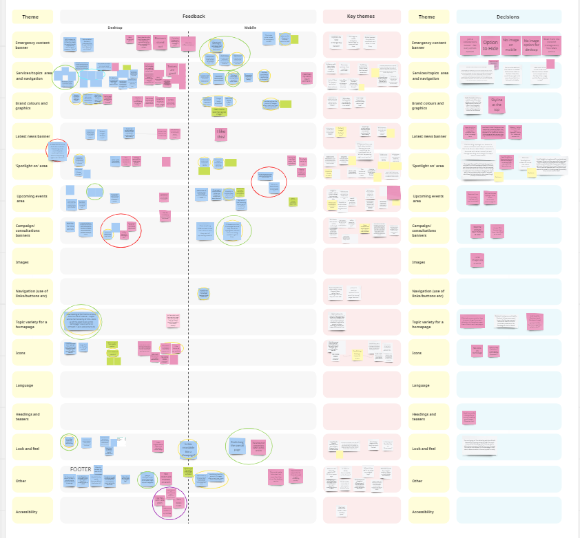
Image: Black hat feedback session – home page
The build
Jon, Elena and Harry, our software developers, having worked with Anna from the first stages of design, were then clear on what and how they were building each component. They held regular peer reviews and made decisions together with Anna and other members of the team, when it was possible, to see the designs in a real environment to improve look, feel and useability.
Yas, our Quality Analyst, or Gandalf as she has now become known, took this opportunity to build some new automated quality tests for the website, which means we should know about issues faster than before. Our Dev Ops team, John and Ed, have worked hard behind the scenes to make sure the infrastructure of the platform performs well.
Observing the team working together, picking up issues, deliberating them and resolving them has shown how seriously and professionally each member takes their individual role and their contribution to the wider team. Responsibility for success and failure is shared and felt by all of us. Our Delivery Manager, Stephen, has made it a mission to create clear, well-understood and used methods of communication for the team so that everyone has a voice.
And then there’s me. As well as being the product owner for the website changes, I’m also the Design Team Lead with responsibilities for Content Design. I worked closely with Anna at the start of the process to make sure we had real content to design with so that when it came to populating the new site, we knew it would all fit together. Adding content to the contemporary designs that was engaging and valuable was essential to bringing the website changes to life. Making sure we’re showing Stockport and the council in the best way possible.
And… go!
The actual release of the homepage had a couple of false starts as we went through a learning curve of engagement with our many stakeholders. Through this final process, we learnt valuable information which influenced some final design changes, and we launched the new Stockport.gov.uk homepage on 1 November 2023.
By focussing on the new Brand Book, the site is brighter in colour, more accessible, performs better, has more information on services, and new ways to focus attention on what’s happening in Stockport, council campaigns and priority calls to action.
We use a variety of tools, including Lighthouse, Site Improve and Axe, to measure the website’s performance. As a result of the changes we’ve made, we’ve seen page load time speed up, images display more efficiently as we only load what people see rather than the whole page, and our accessibility score increase.
What’s next
The second website release will be our topic navigation areas. Because we designed the homepage with reusable components, many of the elements we need just slot together and are tweaked to fit the new page. Planning and understanding the reusable components across the site saved us time and effort in the design, testing and delivery of the topic area, and we hope to repeat this for each new page we look at. Topics should be delivered in the next month, and then we’ll move to phase 3 – directories!
Sign up for email alerts for regular updates from the #DigitalStockport blog.


Congrats to you Laura and the team. It’s great to see and hear about the development of the website following your own analysis and user feedback. Great stuff!