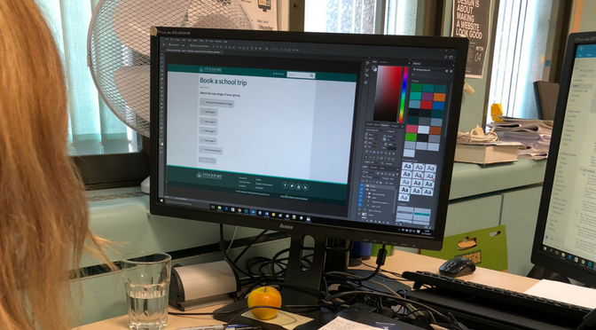
For the last couple of weeks the User Experience (UX) team have been working on creating an online booking form for users to be able to book a school trip at one of Stockport’s museums and attractions.
We started out by doing some initial research to find out how teachers currently book school trips and what would make the process easier for them.
We worked with the museums team to find out about their current process – and even though we all had our own assumptions and ideas – we knew we needed to speak with teachers, who are our primary users, to get their thoughts on what would improve the process.
Visiting schools
We visited two schools in Stockport (Alexandra Park and Moorfield primary school) and spoke with four teachers who had previous experience booking school trips.
Our research told us that the most common method for booking a school trip was by calling or emailing the venue. They told us that they don’t have the time to be chasing emails and making phone calls, so an online booking form would be ideal as this would make the whole process quicker and easier for them. You can read more about this research in our blog on ‘Doing our homework on school trips’.
The research gave us a starting point for an early version of the form. We worked with the content team to make sure that the information on the website would provide teachers with everything they needed before they booked a trip. We also worked with the museums team throughout the process to make sure that the information was accurate both on the website and on the form.
Using research to design the form
We knew that because the teachers had little time to spend on booking trips, the form had to be as simple as possible, so they could easily book a trip in their spare time or even out of hours when they’re at home.
Our research told us that teachers want to either book a trip based on the venue and word of mouth or book a trip based on the topic they will be studying. So, when we designed the form we decided to include the venue and title of the trip in one question. This way, teachers had a choice between choosing a trip at a venue that they’d previously been to or heard about, or choosing a trip based on the topic.
Testing the form with teachers
Having completed an early version of the form, our next step was to take the prototype out to teachers. We wanted to get their thoughts on the clarity of the questions and the different options they had to choose from. We needed them to be as honest as possible with their feedback, so we gave them a scenario of a trip and asked them to use the form to book it.
We visited St Thomas’ C of E primary school and tested the form with Samantha and Sarah who gave us really positive feedback, with most of the comments being how quick and easy it was to book a school trip. They liked the fact that they could book a trip in their own time and not just during the museum or attraction’s opening times. They also thought that the questions on the form were self-explanatory and easy to understand.
Feedback helps us to validate our assumptions and gives us ideas on how we can make improvements. When we test, we want to make sure that the product meets users’ needs, so we pay particular attention to observing their behaviour and looking at how they are using it as well as listening to what they’re saying. We also encourage them to ‘think aloud’ and tell us their thoughts about what they’re liking, disliking or things they find confusing.
It was great to find that both teachers found the form easy to use and understood the questions. They also gave us some feedback on adding extra information about what documents they receive when they’ve booked, so this is a great example of how user testing helps us to identify any gaps and make improvements.
We’d like to thank Sarah and Samantha at St Thomas’ C of E primary school for freeing up their time to help us – their feedback has helped us to improve the form and also confirm that what we’ve created meets teachers’ needs.

