We’re now starting to create a brand new website for healthystockport.co.uk. Over the last three weeks we’ve set up our technical environment, implemented a brand new two –stack Content Management System (CMS) approach and we’ve been creating guidelines relating to design and content for all our future websites.
This first exemplar site will be used to prove the technical architecture and CMS before moving on to creating a brand new website for stockport.gov.uk.
User Interface Design
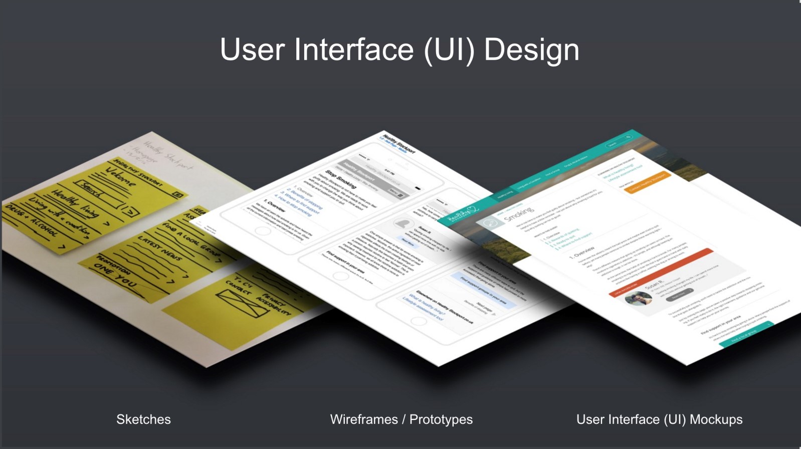
One of the first things we did was look at page-flow – how users navigate through the Healthy Stockport website, how they access information and progress from page to page. From there we started considering what will appear on each page.
The process starts with quick freehand sketches, before we invest a bit more time producing low fidelity wire-frame prototypes. At this stage we don’t care about colours, logos etc., just what that information is and the order of the information. From here we move onto what the page actually looks like and create User Interface (UI) mock-ups.
These ‘pictures’ are made by designers to demonstrate how the page could look when its built by developers. They take into account visual style, the use of colour, details, icons, fonts etc. but they are neither a working website, nor is anything firmly fixed yet.
Working this way allows us to quickly test the new pages and alter them as required, whether that’s the colour of a button or the entire layout.

Living Style Guide
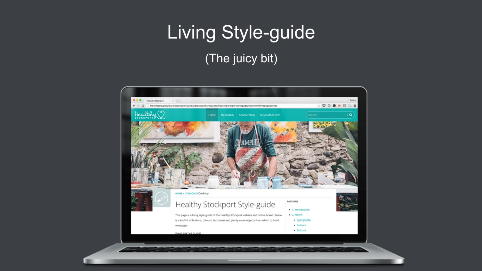
As we’re building the exemplar we are also producing the ‘Living Style Guide’. This is essentially a web-based toolbox created to store all the pieces of the website as we build them. Icons, fonts, colours, images and buttons will go in this kit as along with guidelines for image usability etc. This Style Guide is ‘living’ because it’s constantly evolving.
It will be used by designers and developers as Services request new pages, ensuring that the design and user experience will be consistent. It will also be available to Services to help everyone understand what visual aspects are available on the website.

One site, many devices
The Healthy Stockport website will be built in a way that makes the same website usable on any device. Layouts will adapt responsively from desktop size to tablet to mobile without losing their navigational structure and usability and the access to all the information the end-user requires.
The new site will be agnostic in terms of device used to access it.
Information architecture
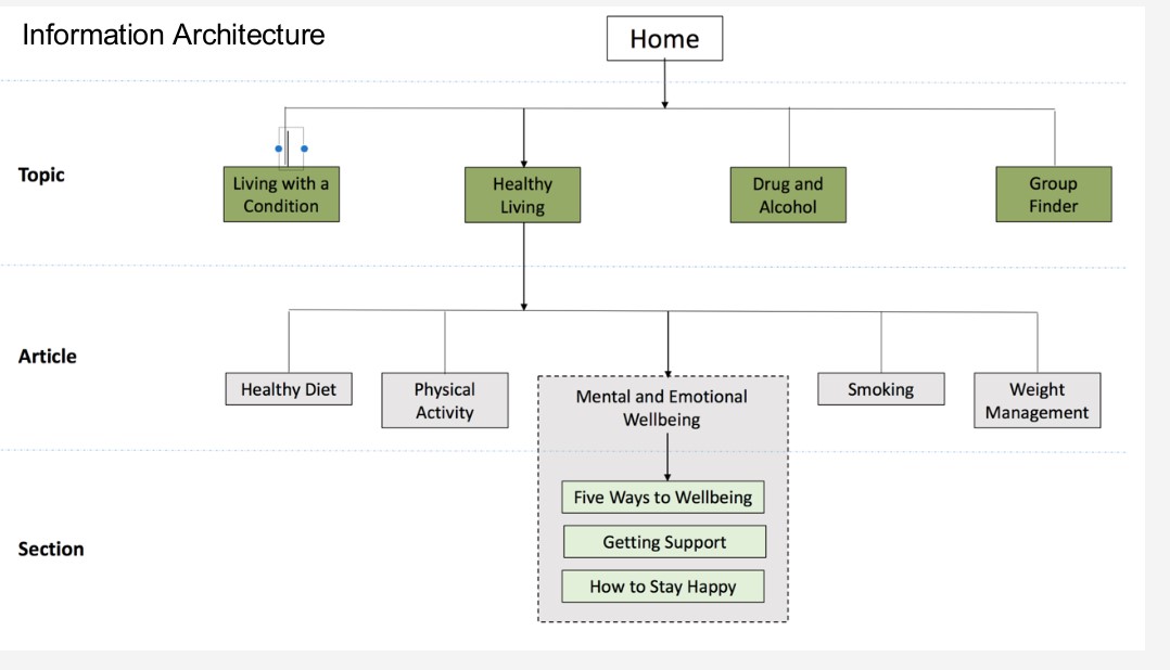
The starting point for the Content team was the site structure and how users navigate round the site. It’s crucially important that when our users are on the page they know where they’ve come from and where they’re going next and what else is around them.

Content
The new Healthy Living content has been greatly improved thanks to a combination of subject expertise from the Council’s Public Health team and the Delivery Team’s content writing skills. We worked closely with Public Health to look at content already on the existing website, to determine what we want to carry forward and offer on the new site and to avoid duplication of information available on other websites such as NHS Choices.
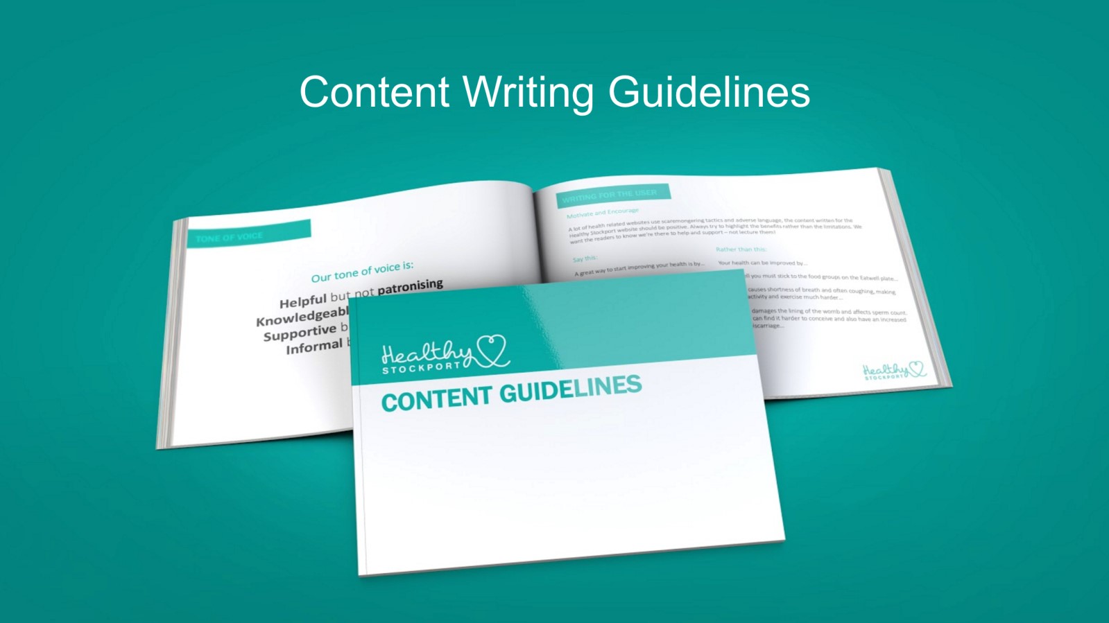
We also used a Content score card to grade the content already on the existing website, looking at sentence length, paragraph length, duplication across the website and jargon for example and from this we have created Content Writing Guidelines which contain tone of voice, hints and tips and guidelines that will ensure content meets the new Information Architecture and User Interface criteria.

Content Management System
Once the new information architecture and content are drafted, content editors will then add this onto the website using a CMS platform called ‘Contentful’.
During our first Showcase to customers and stakeholders a demonstration was given to illustrate the speed and ease of adding a new piece of content, publishing it and the website displaying it to the end-user. The demonstration was at a very basic level but clearly showed that the foundation work has been done and it is a working piece of software available to people within the Council.
Roll-out
We will continue to build the blocks of the website and plan to launch a brand new healthystockport.co.uk website and soft-launch the first pages of a new beta.stockport.gov.uk site to the public this summer.
Other pages and features for beta.stockport.gov.uk will be created once the new infrastructures, information architecture and two-stack CMS are proven.
The model of ‘expert in field’ partnered with ‘expert in service’ will be rolled out starting with the pages with the highest priority content, with information pulled across from the current website and new content developed where necessary.
During the period of transition we will be running the two stockport.gov.uk sites in parallel so that users still have full access to our current digital offer but identified content will be improved, lifted and shifted piece by piece into the new beta.stockport.gov.uk site for our users to use and feedback on so that we can continue to develop a stockport.gov.uk website for them.
