Over the past few months a lot of work has been done to review the content on the Council website. The work undertaken has reviewed each area of our user’s online experience, including the content, presentation, search results and navigation.
With the Local Elections and the EU Referendum taking place this summer, it was the perfect time for us to review the Elections web pages.
To make sure we were heading in the right direction and to gain an understanding of the service area, we worked with our colleagues in Electoral Services.
Research phase
The first stage of our content review involved us getting together to map out the current ‘as-is’ user journeys for various processes within Electoral Services. This not only helped us gain an insight into the service behind the scenes, it also highlighted any ‘pain points’ that the service currently face.
The next stage was to create a ‘to-be’ user journey. This time we mapped out the way we would like these processes to work in an ideal world. We made ‘assumptions’ that there were no technical restraints which removed any pain points.
This process helped us to identify the current issues within the service as well as things we could make better when creating the new content.
After gaining this initial understanding, another workshop was organised with Electoral Services. This time we created ‘personas’ to help us identify any gaps within the content on the website.
Below is an example of a persona that was created in the workshop:
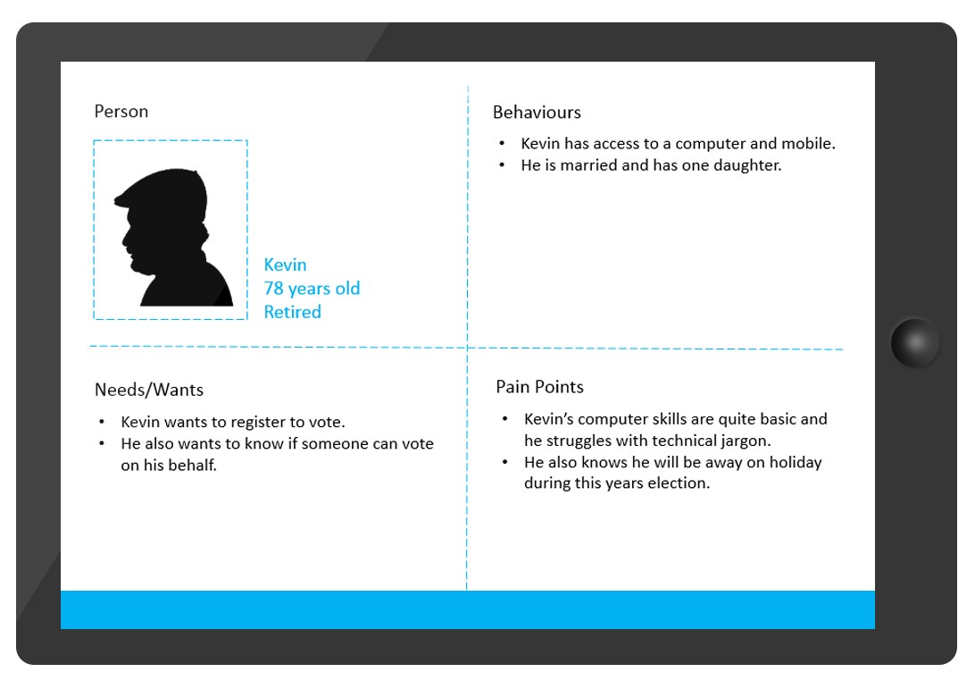
The purpose of using personas is to create realistic representations of our key audience. When creating a persona we look at the user’s needs and wants, behaviours and any pain points that they may face when accessing information on our website.
Creating the Content
After completing our research phase it was time to use the things we’d learnt to create a new Elections area.
Something that came up a lot during our research was that all the information surrounding the elections sat within the ‘Register to Vote’ page. It turned out that this page only contained a small amount of information about actually registering to vote. The image below shows the original layout of the page:
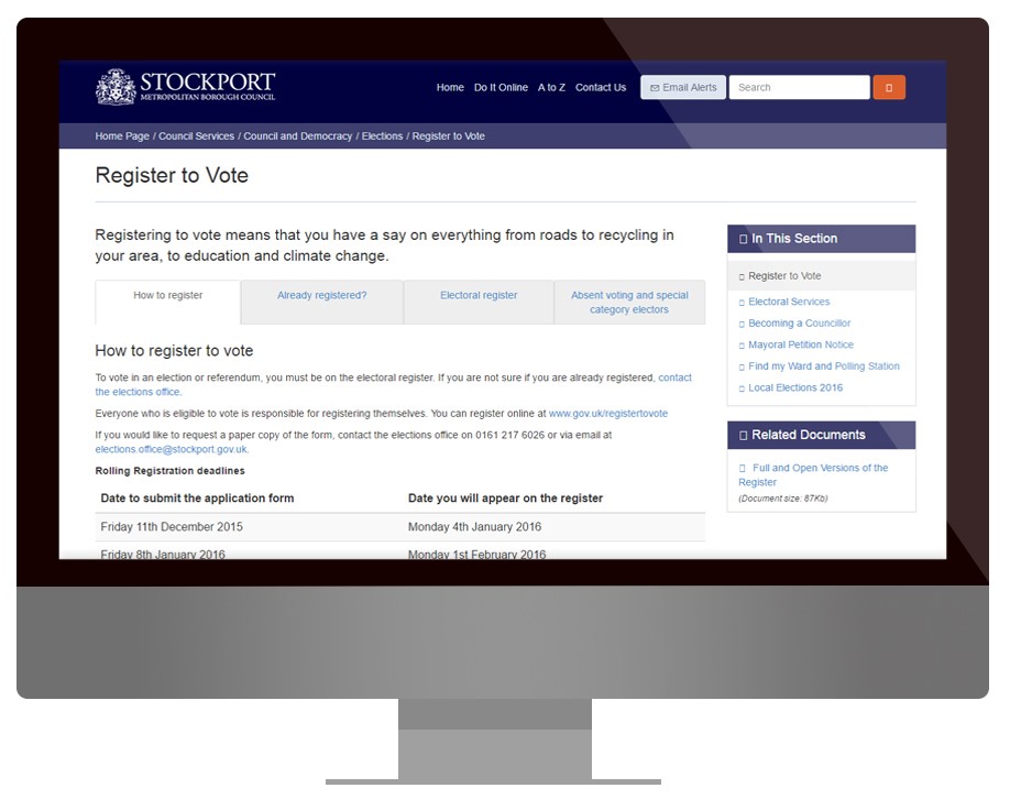
After Electoral Services shared some of their most popular queries and issues with us, it became clear that the content on this page needed to be more prominent and would be better served on its own page. This would also allow the ‘Register to Vote’ area to serve its purpose efficiently.
The content was split into categories which created a new page named ‘About My Vote’, providing our users with information and online solutions for their most common questions.
A lot of issues that users faced stemmed from the fact that they found the terminology and ‘election speak’ confusing. This was something we were keen to fix when designing the new content. We took a more user friendly approach and where we did have to use jargon, we explained it.
The examples below show old content compared with the new content.
Old:
“Absent voting – Voting by proxy is a convenient way of voting if you are unable to get to the polling station. Your proxy voter is someone you nominate to vote on your behalf.
To vote by proxy, you will need to fill in an application form and return the completed form to the electoral registration office.
If you appoint a proxy, they can either go to your polling station, where they will be given your ballot paper, or they can vote by post.”
New:
“Have someone vote on your behalf – You can appoint someone to vote on your behalf if you are unable to get to the polling station. This is called voting by proxy.
To do this, you will need to complete and sign an application form and return the form to the electoral registration office.
To find out more information and download an application form, visit the About My Vote website.”
The examples above show how a small change in language can be so effective. The term ‘absent voting’ has been discarded and replaced with something that will make sense to our users. We explained the term ‘proxy’ straight away and then refrained from unnecessarily using this word.
We also made sure that rather than duplicating and repeating information, users are directed to other reputable sites such as GOV.UK.
The image below shows the new About My Vote page:
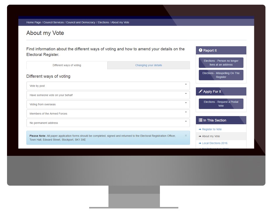
As shown above the online forms have been put into buttons on the left hand side of the screen, these were previously lost as hyperlinks within the text.
The New Area
After creating new pages for this year’s Local Elections and EU Referendum based on the findings from our research, we had our final layout. We then ordered the new pages based on the most popular needs and wants from our users.
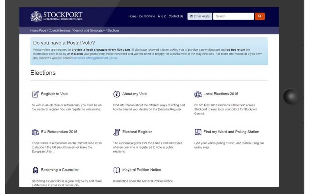
The screen below shows how icons have been added to each branch to improve presentation and help users identify each page easily.
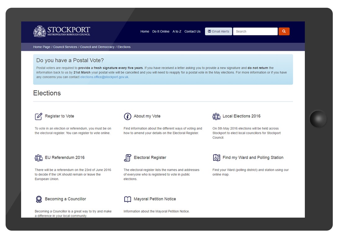
Once we were happy that any previous issues had been solved in the new content, we moved the section to Beta testing and for the final review.
The feedback was positive and after some minor changes the new section was ready to go live.
The aim of this content review was to make sure that our users can find answers and complete actions online, offering a seamless journey and reducing the amount of calls received by Electoral Services.
To view the new area, visit www.stockport.gov.uk/elections
If you have any feedback or questions about the work undertaken, email us at website.updates@stockport.co.uk

