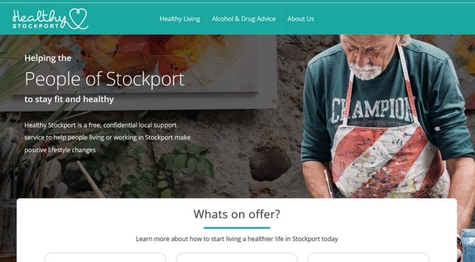
One month ago we launched a new website for Healthy Stockport as part of Digital by Design Release 2.
The process for creating the new website started much earlier this year with research to find out more regarding usage of the Healthy Stockport website and its tools and to better understand user needs and preferences when accessing health information.
We spoke to GP’s and specialist advisors to understand the demand for wellbeing services and opportunities to empower patients by providing information and self-serve tools. We also spoke to residents who were already following Healthy Stockport wellbeing and lifestyle programmes to understand their informational needs and their experience of the services. We looked at the statistics indicating current usage of the website and we also asked the residents we interviewed about their digital usage.
As-Is Insights from research
- There was a great deal of useful information on the site but because there was so much information users found it difficult to find the advice and guidance specific to their needs
- There were some good tools on the website but they seemed to be quite long-winded and people would also prefer to use them without logging in
- There was duplication of information available on other NHS and Health charity websites and forums
- There was a low level of awareness of the Healthy Stockport service and the self-referral process
- The existing website had a low level of usage.
To-Be Insights from Research
- There was a need to ensure users could easily find the information they required
- There was demand for access to localised information related to healthy activity groups etc.
- The content could be presented in a more modern and visually appealing way
- There was demand for information on staying healthy as people get older and also information on men’s health
- Online self-help tools are valuable but the messages need to be correct for the audience
Having identified the current pain-points and the opportunities for digital improvement to the service, we commenced with our redesign of the website.
New layout and navigation
One of the first things we did was look at page-flow – how users navigate through the Healthy Stockport website, how they access information and progress from page to page. From there we moved onto wire-frame prototypes and User Interface (UI) mock-ups, which allowed us to test the usability of our new pages quickly and easily with our end-users.
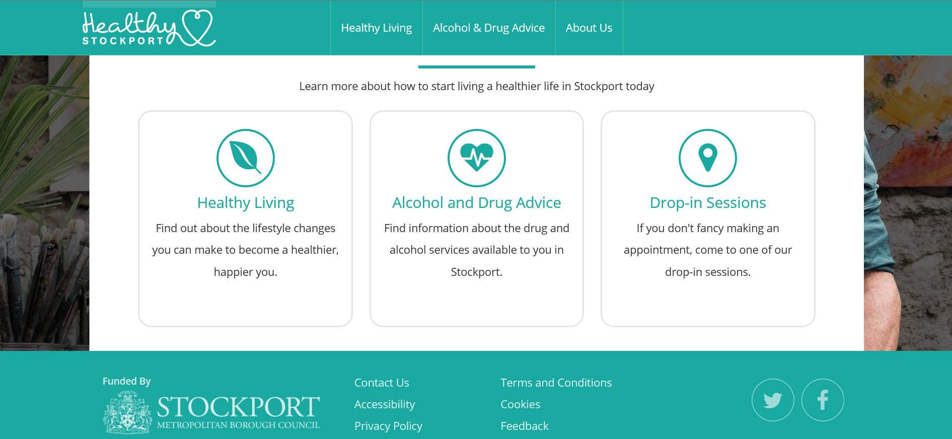
This new website is fresh and modern and clearly laid out to make it easy for people to find the information most relevant to their needs.

Changes to content
We looked carefully at content already on the existing website, to determine what we wanted to carry forward and offer on the new site and to avoid duplication of information available on other websites such as NHS Choices. The combination of subject expertise from the Council’s Public Health team and the Delivery Team’s content writing skills enabled us to make the content more user-friendly.
How to encourage people who live and work in Stockport to use the website?
Our Inception process identified that our Unique Selling Proposition for the website was that it should be relevant to local residents: a website for people that live and work in Stockport who want to find out more about a healthy lifestyle.
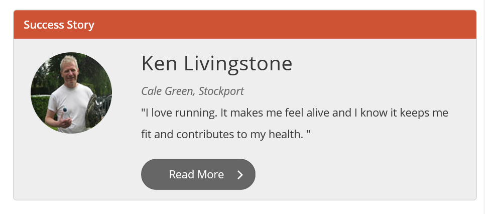
One feature that we have introduced is local success stories to inspire the people of Stockport in their healthy lifestyle goals. Read in conjunction with our Healthy Living Guides these send out powerful locally targeted messages to help people to make long-lasting health changes, whether they want to stop smoking, eat a healthy diet, get more active, achieve a healthy weight, improve their mental wellbeing or reduce the amount of alcohol they drink.

As well as the content already available, more features will be added over the coming months including a local directory of services, a Lifestyle Assessment tool and guides on living with long-term illnesses.
Feedback and analytics
For the launch we issued a press release and posts on Facebook and Twitter inviting feedback, comments and suggestions on the new site from local residents. We also promoted the site internally to SMBC staff for their comments.
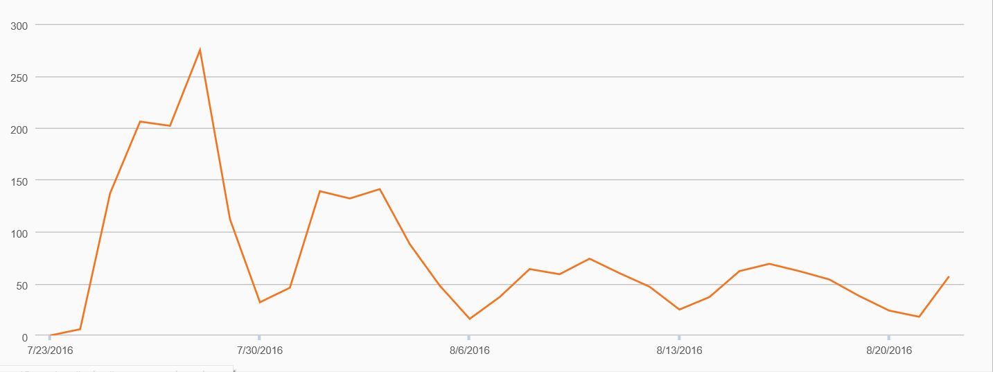
We are monitoring usage of the site through analytics. In the month since launch the website has been visited 2367 times by 1839 unique visitors with an average of 3.9 pages viewed per visit.

Website visits
The most visited sections are the Healthy Living pages (we can drill this down further to assess the relative popularity of the pages on physical activity, healthy diet, healthy weight, mental and emotional wellbeing and smoking) and the Alcohol and Drug Advice pages (again we can assess relative interest in alcohol and drugs advice).
We are also looking at exits from our website to assess where on the user journey we are losing people so that we can make changes that will keep our users engaged with the site for longer. And we can look at ways of improving the number of visits to pages that are currently under-performing compared with expectation.
This ongoing cycle of monitoring, feedback and comment is essential if we are to become the first-choice source of information, advice and guidance on healthy living for the people of Stockport. We will continue to make improvements to the website based upon this feedback as well as introduce the planned new features. We will also be planning a Communications push following the introduction of the new areas.
If you haven’t yet had a look, find out more at: https://www.healthystockport.co.uk/ and please let us know what you think.

