Before this week’s Programme update, a quick reminder that we are still recruiting in for IT and Digital by Design positions. We have a new recruitment process and are happy to have an informal conversation with you if you’re interested in any of the jobs available.
Digital Transactional Services
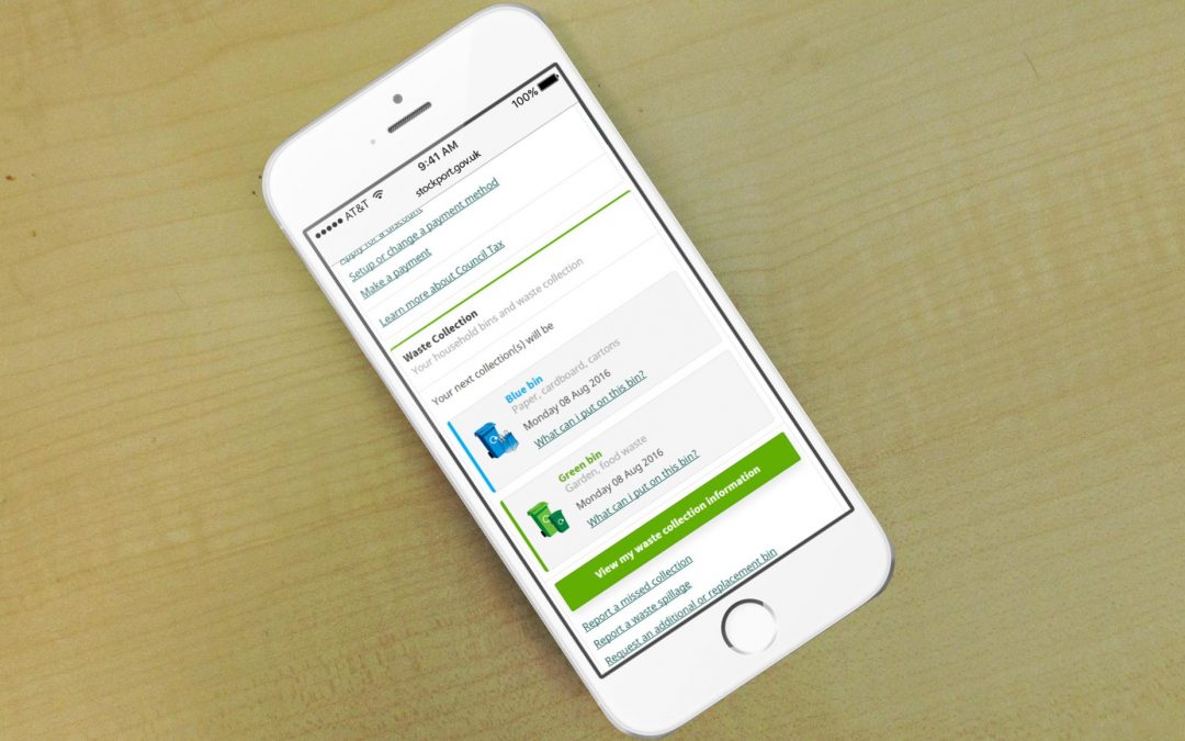
This week has seen the release of beta My Account in its initial form which allows the citizen to create and verify a login and access information on personalised waste and recycling collections.
This is a very soft release with no Comms to the public yet, but we are starting user testing with our contact centre staff and we encourage you to try it out and feedback to us. (You can access it on any device but currently you will only see the mobile version.)
We are hoping soon to add the Council Tax feature which has required the development of a more complex verification process to confirm the property. As we add new features to My Account the customer will only need to login once with their personal information but each new service that we add will need to be verified as it is added.
As the code we have created is reusable, we have also been working with IAG who will be using this code to create a school catchment feature and bins information on beta.stockport.gov.uk.
Next we will start scoping with Services to work out which will be the next new features added.
Information Advice and Guidance (IAG)
We have added several new capabilities to our News feature including a sidebar which shows the six most recent articles, the ability to share stories through Facebook, Twitter and email and tags to enable users interested in a particular story to find similar articles.
We have continued to copy more content from the existing site to the beta site in preparation for the beta site becoming the main site later this autumn.
And we have been creating short urls which makes it easier to link data across the site and direct people directly to pages deep within the site without the need for lengthy links.
User Experience (UX)
We continue to observe how our users are using both our new website and our existing website.
Quantitatively we know from analytics exactly what people are doing on the website, how they got there, what they look at, how long they spend there and what they do next. We can also look at the devices they use so we know that around 50% of visits are from mobile devices and this has guided our ‘mobile-first’ design principle.
To find out why people do certain things, such as leave on a certain page or leave a form before completing it we need qualitative feedback, which is why we do user testing every two weeks with the citizens of Stockport. We have also been receiving feedback from our form on the beta site and we have made a number of changes as a result of this.
As qualitative research is typically much more time intensive we use a combination of both methods with quantitative data flagging up areas that require further qualitative research.
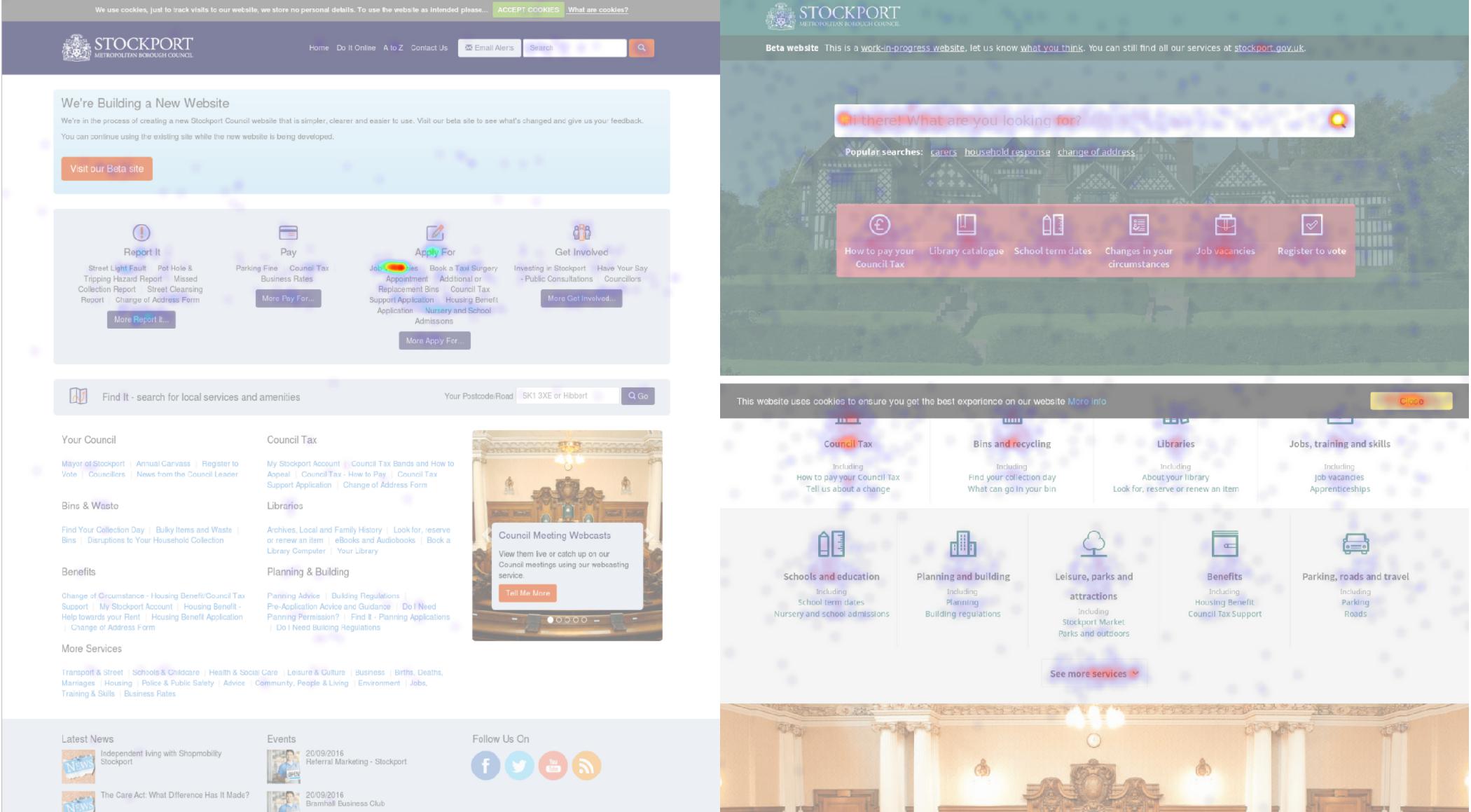
Heatmaps are one of the quantitative tools we use for investigating UX. We can see that most visitors to our existing website home page focus on the ‘Report it’ and ‘Apply for’ categories. Inevitably this leads to a longer user journey as people currently have to dig deeper into the website to find the area they need among the vast number of services offered by the Council. Indeed, we found that in 8 out of 10 times people go from the home page to another navigation page.

Looking at the beta website by comparison, we see plenty of traffic around the search bar. This is exactly what we are looking for as from search our users can reach the service or information they require much more quickly. There is also a lot of activity around the quick links and the direct service links. So for the beta site 9 out of 10 times people go from the home page directly to a content page.
Onto this knowledge we can layer the insights gained from the citizen observations. We’ve discovered for instance that users return to the home page between different searches, even when they are moving from one page to another within the same area of content. Which is where the search bar comes in. Everyone we’ve tested with used the search bar first. People expect to be able to search. Only if they don’t find what they’re looking for do they move onto the quick links.
We also know that our users are transactional, that is they aren’t coming to our website to browse casually, they want specific information or transactions. From this knowledge we are looking to adjust the dashboard product we are creating.
The best news is that 100% of people we’ve tested with used the site successfully, without assistance or prompting, even a citizen who had never previously used the internet!
Case management
We have introduced a new Case management system for our new public health service which went live on October 1st, combining Drug and Alcohol support with the Healthy Lifestyles referrals service.
A new transactional online form has been added to the Healthy Stockport website with a step by step guide to providing the relevant information that the Services need from which a case is automatically generated.
We are currently working on Service redesign for Local Advice Centres, Benefits Appeals & Debt Advice and the Verint Case Management system trial is also near completion.

