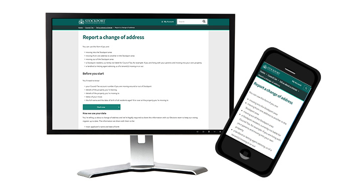
Our new online tools are designed to be as easy as possible to use, however the development process we go through is anything but simple.
In winter of 2017 we began working on what would turn out to be our most complex form to date, a replacement for our Change of Address forms. As anyone who has filled one out in the past few years can tell you the form was confusing, time consuming, it wasn’t mobile friendly and it didn’t meet the Council’s accessibility standards.
Through our collaborative work with the Council’s Revenues & Benefits department, the team began the difficult task of analysing, designing, and developing a brand new form. After months of effort, the improved Change of address form was made available to the public June 18th and you’re sure to notice the improvements we’ve made.
Features of the new Change of Address form:
- Better user experience. Our Content and User Experience teams worked tirelessly to ensure users would only need one form that asked users smart questions, instead of the three forms used previously. As a result, the form tailors itself to the user allowing for a more effective and shorter journey.
- Mobile friendly. Since the start of our Digital By Design program, it has been our goal that every product created would be mobile friendly to better suit the busy Stockport citizen. We built this form with that goal in mind.
- Improved email confirmations. We now send email confirmation to users. The old form did not. Enough said.
- Ability to upload documents outside of the form. Now users have the ability to upload documentation, when their application requires it, via secure links provided within their email confirmation. This helps out residents who didn’t have all the necessary documentation to hand when they submitted the form.
- Set up a Direct Debit inside the form. Working with our BACS banking partners, we were able to develop the capability to verify banking details at the point users enter them into the form. With this feature, we can streamline the application process by sending the applicant’s data directly into CIVICA (our Revenues and Benefits system), reducing the amount of back-office manual entry significantly and reducing user wait time.
- Made with accessibility in mind. We spent a lot of time developing functionality and the overall design of this form to meet Level AA Standards. We are taking what we’ve learned and applying it to our other current and future projects, the goal being continual improvement.
It’s still early days for the new form, but we’ve already received high levels of positive feedback. Moreover, while there is still the occasional bug to fix, this has been one of the smoothest rollouts since the creation of the Digital by Design program. We’re very pleased with the results of the form so far, and happy about how well it’s working for the public.

